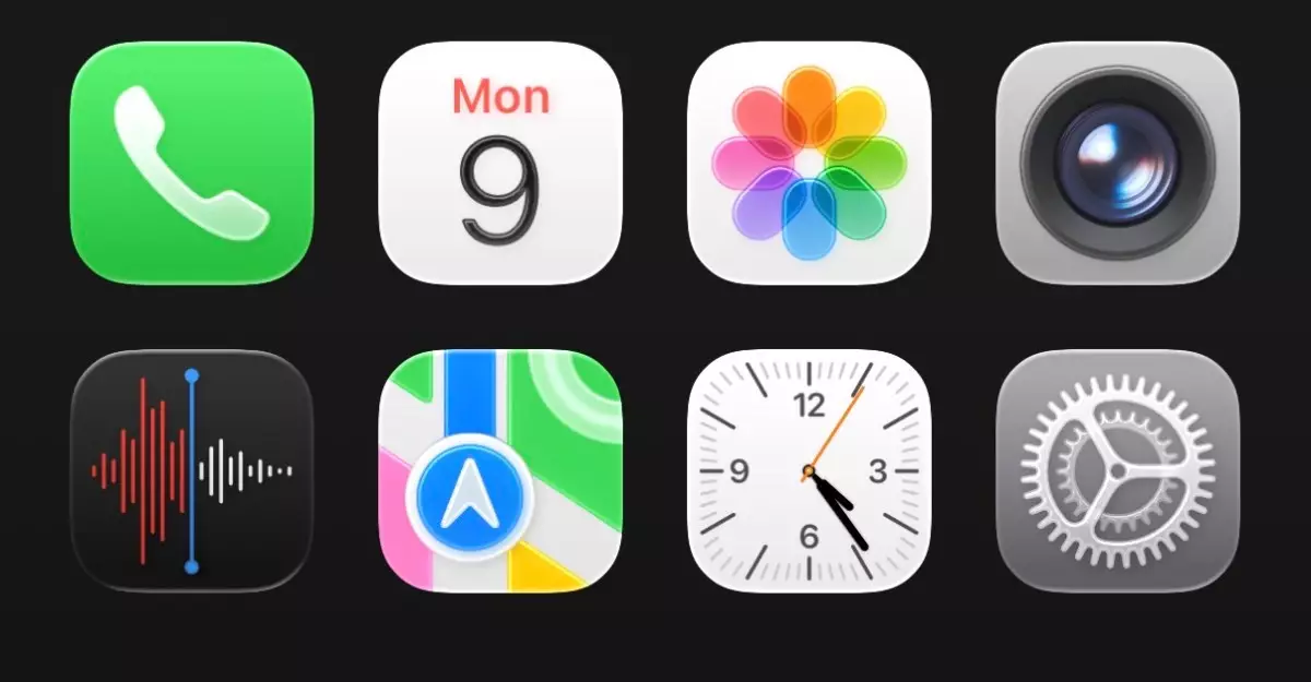
Apple’s unveiling of the Liquid Glass design language at WWDC 2025 marks a significant leap in interface aesthetics, combining translucency with a fresh, dynamic feel. For a company defined by its commitment to innovation, the introduction of a feature that superimposes a glass-like veneer over the existing interface presents both an evolution and a challenge. As I delved into this updated design on my iPhone running the iOS 26 developer beta, my initial reaction was mixed; while I appreciate the ambition behind the Liquid Glass approach, it’s clear this new interface could benefit from further refinement.
A Shiny, Translucent Experience
At first glance, the effects of Liquid Glass are mesmerizing. Icons seem to float over the background—a technique meant to create a layered, three-dimensional experience that teases at what lies beneath. This adaptation is apparent not just on the home screen but also manifests in subtle ways throughout the operating system. The app icons and interface elements feel more fluid than ever, evoking a sense of modernity that aims to resonate deeply with users.
However, juxtaposing my previous iOS 18 experience with iOS 26 unveils a disconcerting truth. The effects can feel overly ambitious—especially in the context of usability. There’s an abundance of transparency which, although aiming for a sleek appearance, can lead to visual confusion. The vibrant hues of app icons, paired with the glimmering backgrounds, can easily create a chaotic tableau, reminiscent of a busy art installation rather than a seamless digital interface.
The Control Center Chaos
One of the most striking examples of this chaotic beauty lies within the Control Center. While its new design incorporates elements of the Liquid Glass theme, it unintentionally fosters a sense of clutter. The clarity that one would expect from the Control Center is diluted in favor of graphical flair, significantly hindering quick usability—an essential aspect for a feature that is accessed frequently. The rampant transparency not only disrupts the visual hierarchy but may lead to moments of frustration when users seek instantaneous access to settings.
Importantly, it is crucial to note that Apple has historically excelled in refining interfaces based on user feedback. My hope is that, as user experiences coalesce with Apple’s design aspirations, the company will prioritize functionality in the forthcoming updates and ensure that clarity isn’t sacrificed for style.
The Intricacies of UI Changes
Moreover, the Liquid Glass design permeates various applications, imparting a sense of cohesiveness across the platform. The clock app showcases intriguing animations, albeit not without implementation pitfalls. For instance, the energetic movement of the selection tabs draws attention, yet there’s a sense of disorientation thanks to the visual impact of Liquid Glass. Experimental but unrefined, this element might need moderation to harmonize with the ongoing user tasks.
As I explored additional elements, such as the keyboard and the revamped Safari browser, a pattern emerged. The illusion of depth created by the Liquid Glass design extends into the minutiae, yet instances like excessive white space in settings underscore an inconsistency that calls for better calibrating user engagement.
Reflection and Anticipation
Initially, I found myself at odds with the audacity of the Liquid Glass design, grappling with the aesthetic shifts that have radically transformed my interaction with my iPhone. Historically, I’ve embraced previous UI changes with open arms, so this resistance was unexpected. However, after numerous interactions, I’m beginning to appreciate what Apple potentially aims to achieve—a layered experience that transcends mere functionality and embraces artistry.
While it’s true that first impressions can be deceiving, the evolution of the Liquid Glass design invites a broader dialogue about UI design philosophy. Apple appears to be writing the next chapter in its storied legacy, poised to challenge user expectations while redefining what modern interfaces can look and feel like. The journey ahead is laden with promise, but I genuinely hope that functionality doesn’t get lost amidst the allure of shiny surfaces. Only time and iterative developments will reveal if this gamble pays off and users can truly navigate the future with ease and enjoyment.

